Finding the best "perfect"
Or, as submitted...
Roads Less Traveled:
When to Detour from Standards to Reach Accessible UX
Presented at CSUN 2019
Accessibility and inclusive UX can be hard...
 (thank you captain obvious)
Notes: a11y and inclusive UX can be hard
Not just within the scope of auditing, writing criteria for new accessible features.
But specifically when you have to convince designers, developers, and stakeholders to make it a priority.
Getting buy in can be hard. It can be harder when you get buy in, and then you follow criteria, specifications, best practices, and things don't work out as expected.

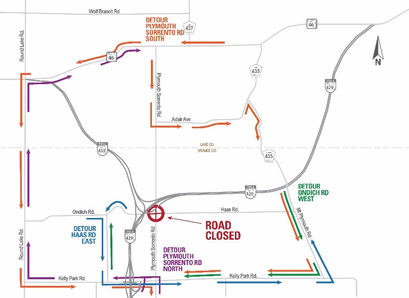
If a road is closed, find another way
Notes: road closed
There is never not another option. Whether it's a design change, or deviating from generally accepted best practices.
If we can figure out a way over, around or even barreling through that gap. Let's take it. (Note: I'm not advocating for hacks that would create significant tech debt, or create a poor experience for when a bug is fixed. Rather I mean we should implement 'silent' work arounds that would have no impact were a bug to be rectified. Or implement a separate pattern/design that wouldn't cause an issue and possibly could have better UX anyway.)
HTML Design Principles WD:
3.2 - Priority of constituencies
"In case of conflict, consider users over authors over implementors over specifiers over theoretical purity."
Notes: Priority of constituencies
We need specs, guidance, and shouldn't take for granted the countless hours and hard work that people put into create documents.
But, if there's a gap in implementation, or something doesn't quite make sense or meet users' needs...
We can't just shrug and say "out of our hands."
Searching for
alternate paths:
- When expectations don't match reality.
- When there are no clear expectations.
- When expectations went out the window.
When expectations don't match reality:
role="switch"
Is it a good switch or a bad switch?
What are the issues?
- iOS: role="switch" announces as checkbox & doesn't announce state.
- Firefox and Chrome with NVDA announce as a "toggle button".
- NVDA will always announce "not pressed" regardless of state.
(e.g. "not pressed, checked") - bug filed. - IE11 with screen readers sort of a mix of all the above.
Which switch is switch?
When there are no clear expectations: carousels
Is this what user delight looks like?
should I use a carousel.com
Credit: Jared Smith
No.
But sometimes saying "no" doesn't work...
Carousel Criteria:
- Progressively Enhanced markup.
- Have slides with a single call to action.
- Possibly with optional short description.
- But should not contain multiple accessible elements.
- Strive for UX Equality & considerations:
- Only active slide is accessible.
- Slide purpose & current number is announced.
- All users activate the CTA similarly.
- Keep in mind high contrast & reduced motion media queries
Notes: carousel criteria
The issue with defining something like this, is that the best UX may be dependent on the contents:
For instance:
- Content-heavy single panel carousels
- Single call to action CTA / panel carousels
- Carousels with multi-panels and ctas shown at a time
These may all require different types of UX to make a carousel accessible. Not to mention various different 'add-on features', such as auto-playing, which could potentially diminish the experience for different users.
I have found luck with a single-focus CTA carousel, in projects I've had to write criteria for carousels. Simple UX and functionality created more equivalent and better general UX for all.
Note: a few days before giving this talk I became aware that ARIA authoring practices have released a carousel and they are presently looking for feedback. I would recommend we check it out and provide any helpful feedback we can.
The Markup
<div role="group" aria-label="Name it!"
  aria-roledescription="carousel">

  <!-- visually hidden -->
  <span aria-live="polite"></span>

  <!-- role=presentation added by JS  -->
  <ul role="presentation">
    <li role="presentation">
      <div class="panel-bg">
        <!-- img here -->
      </div>
      <a href="...">
        <!-- CTA text here -->
      </a>
    </li>
  </ul>

  <!-- generated by the JS -->
  <div class="pn-btn-wrap">
    <button>Previous slide</button>
    <button>Next slide</button>
    <p aria-hidden="true">X / Y</p>
  </div>
</div>Single Call to action carousel (demo)
Note: looping has been disabled in this example.
But, I still don't recommend carousels...
repeat of animated gif
When expectations went out the (modal) window
What is a modal dialog:
Dialogs are most often used to prompt the user to enter or respond to information. A dialog that is designed to interrupt workflow is usually modal. - ARIA 1.1
GitHub modal
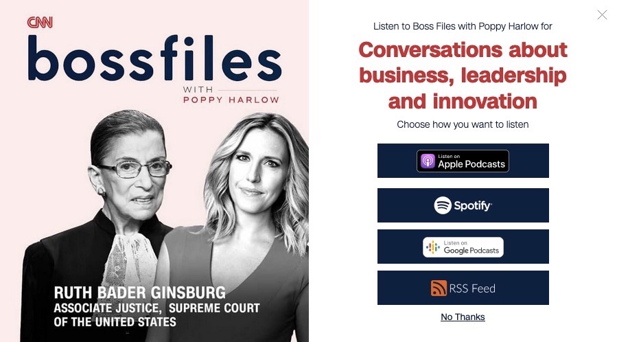
CNN modal
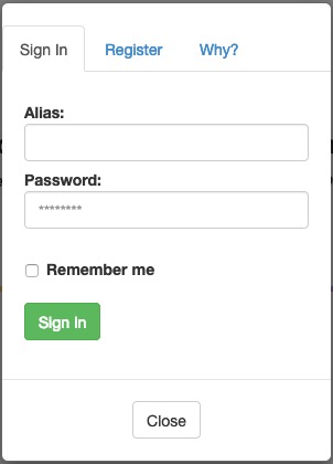
Sign in tab widget modal
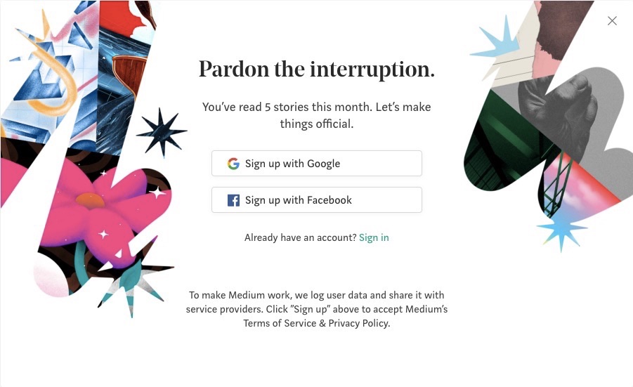
Medium.com modal
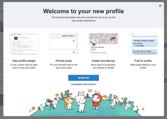
Reddit modal
"traditional" modal
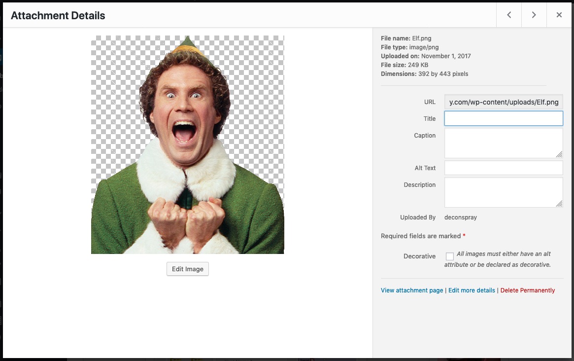
WordPress media manager modal
High level modal functionality
- Creates a sub-window within the primary window.
- Should contain a button to close.
- expectations that Esc and
- tapping/clicking outside will also close.
- Should have an accessible name.
- Should receive and manage focus when invoked.
- Should not allow access to content beneath the dialog.
high level notes
"Should" does not mean "must". "Should" is often encouraged, and typically the most desirable expectation. However, "should" also implies that authors "could" take another path if necessary.
So what are the problems?
First...
We can't rely on the <dialog> element
- Blink-based browsers only.
- Inconsistent accessibility & bugs.
- Polyfill doesn't make it fully accessible.
Second...
- Added to ARIA in 2014.
- Bugged with VO prior to Safari 12
(fixed in Safari 12 - 09/2018) - Support still varies regarding platform.
Tabbing and swiping will still often escape the dialog.
A solution:
inert & aria-hidden
<div role="dialog" aria-labelledby="aName">
  <div role="document"> <!-- but why? -->
    <h1 id="aName">...</h1>
    <!-- STUFF! -->
    <button>Close</button>
  </div>
</div>
<div id="app" aria-hidden="true" inert="true">
  <!-- base document stuff! -->
</div>
Note on role=document
The role=document was added to the code example to mitigate
an issue with VoiceOver quick nav mode.
The issue here being that if a modal dialog has an accessible name, and the contents of the dialog are not wrapped in a role=document, then certain elements within the dialog may be inaccessible when quick nav is on.
This issue does not appear to exist if the dialog does not have an accessible name. Nor does it appear to exist if not using quick nav.
Third...
Initial focus placement is... opinionated...
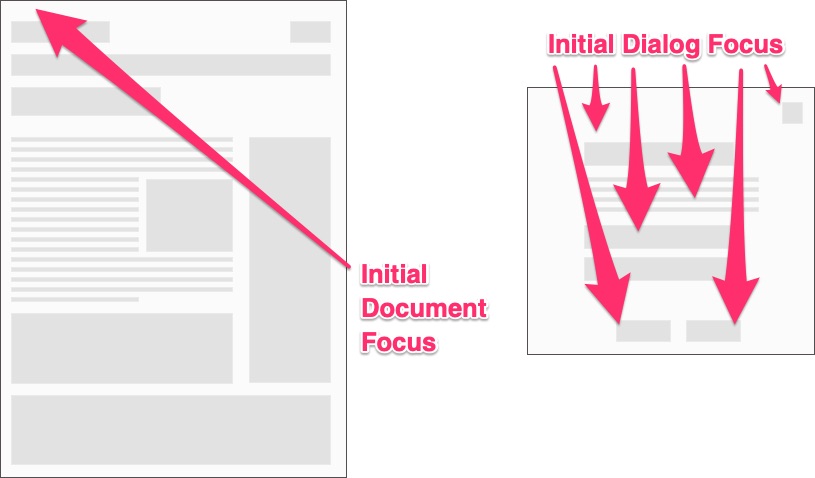
Notes on focus placement
For documents we start at the top
For modals, guidance and implemented native functionality may dictate that focus could go wherever the first focusable element exists, unless it is not in the visible viewport in which case another element must be focused.
There are various quirks in behavior, depending on the screen reader and browser used, when elements within a dialog have been focused.
I've written quite a bit about these in my article on native dialogs, and the current state of modal dialog accessibility (linked in references at the end of these slides)
Solution: focus what makes sense
HTML Design Principles WD:
4.2 - Avoid Needless Complexity
"Simple solutions are preferred to complex ones, when possible. ..."
Whatever your choice, .focus() on testing!
Regardless of where you set focus,
test to ensure the best user experience!
Note on testing
If you've found that your methods for implementing dialogs, focusing them, etc. meet the expectations of your users, then keep doing what you're doing!
Consistency of expectations and meeting the goals of our end users is our priority!
Wrapping up: some take aways
- Don't assume, always be testing.
- Validate features and implementation methods
aka: Do your users need what you want? -
We can help make the web better:
- Find a bug, report it!
- Displeased with guidance? Start a discussion!
Notes on wrapping up
We should remember we're far better off today than we used to be, regarding browser implementations, user experience, etc.
But there are inconsistencies and challenges that we still need to address.
And educate!
Not just the hows and whys of accessibility.
But educate about imperfections, how to test, and strive for UX equality above all else.
So let's just keep striving for the best perfect we can.
Animated gif: stop talking
Thank you
Additional reading
Quite a bit of this talk is based on testing and writing I've done over the past year or so. Here are some links to those posts:
Links to references and resources
Links to bugs and issues
For a list of bug trackers (and a generally awesome article) see Semantics to Screen Readers.